Xero | Reporting Charts
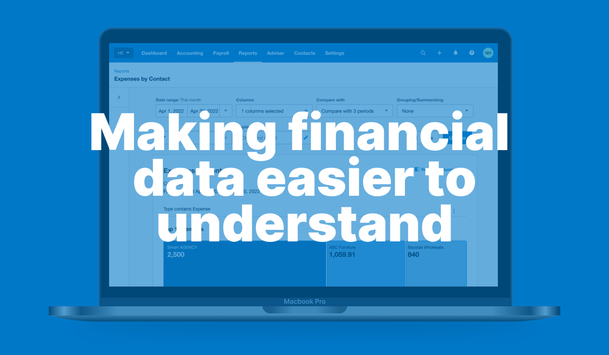
Reports were powerful, but not easy to scan at a glance. To support Xero’s growth in North America, I introduced charts that made financial insights faster to understand without losing trust. This was especially important for small business owners working independently.
- 25% faster comprehension
- 35% improved clarity
- 30% more report opens
- Supported a key growth market
Xero Reporting Charts
Opportunity: As Xero expanded in North America, Reporting needed to better support small business owners interpreting financial performance on their own. The opportunity was to make reports easier to understand, without weakening trust in the underlying data.
Challenge: This was not a simple charting uplift. It required a reporting experience that improved clarity and speed of understanding while preserving the precision, depth, and credibility customers relied on. It also needed to scale across the Reporting framework and feel native to the wider Xero product system.
Leadership: I led the work end to end, from framing the problem through to validation and delivery. Research revealed a critical strategic insight: customers appreciated the speed of charts, but still needed table data to verify, interrogate, and trust what they were seeing. That shifted the design direction from a more visual-only concept to a more integrated model, where charts and tables worked in partnership to support both rapid comprehension and deeper analysis.
Impact: The final solution helped customers interpret reports around 25% faster, improved clarity by around 35%, and increased report opens by around 30%. Strong customer feedback reinforced the value of the final direction, confirming that the most effective experience was not charts instead of tables, but charts and tables working together.
Role: Senior Product Designer
Skills: Product design, UX, discovery, research, interaction design, prototyping, usability testing, accessibility, systems thinking
Company: Xero
At Xero, I led the design of Reporting Charts within one of the company’s most-used and most business-critical product areas. The goal was to make financial reporting more accessible for small business owners, especially in North America, by reducing the effort required to interpret reports without losing the trust and detail behind the numbers.
This was not a simple visual uplift. Through research, strategy, interaction design, and validation, I helped shift the experience from a more chart-led concept to a more balanced model where charts and tables worked together. The result was a reporting experience that improved clarity and speed of understanding, while preserving the depth, transparency, and familiarity customers needed to make confident financial decisions.
The work delivered measurable customer impact and established a scalable reporting pattern that aligned with the wider Xero product system and supported future evolution across Reporting.
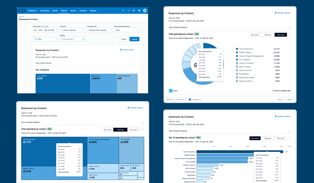
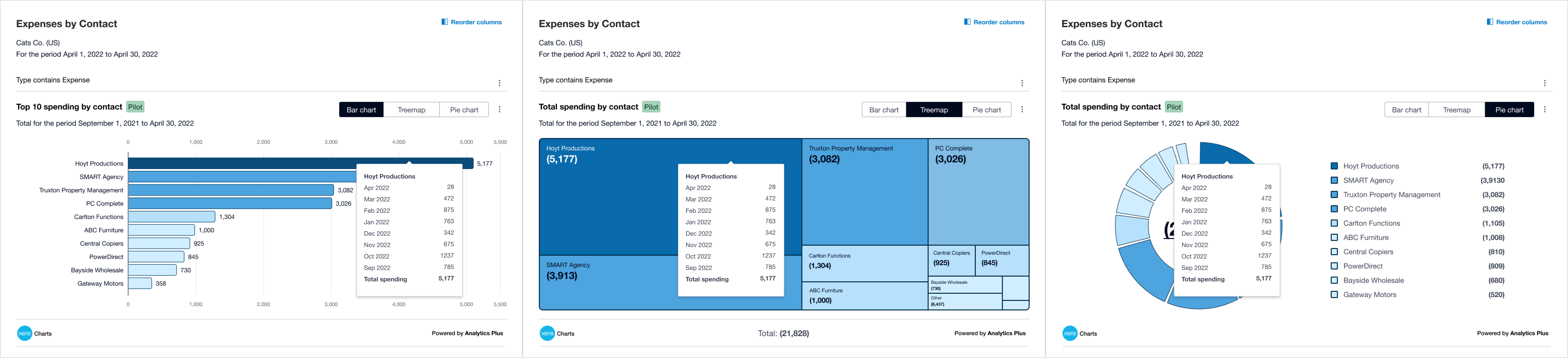
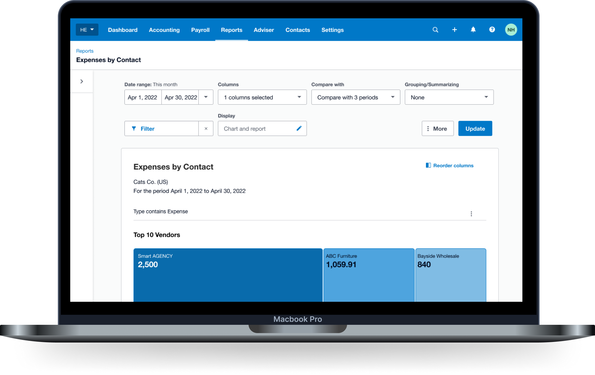 Interactive charts gave customers a faster way to scan report data, switch visual views, and reveal deeper context on demand through hover details and comparative breakdowns.
The breakthrough came in shifting from a more chart-led concept to a more balanced reporting model, where charts supported faster understanding but tables still carried the depth, detail, and trust customers depended on.
 Interactive charts gave customers a faster way to scan report data, switch visual views, and reveal deeper context on demand through hover details and comparative breakdowns.
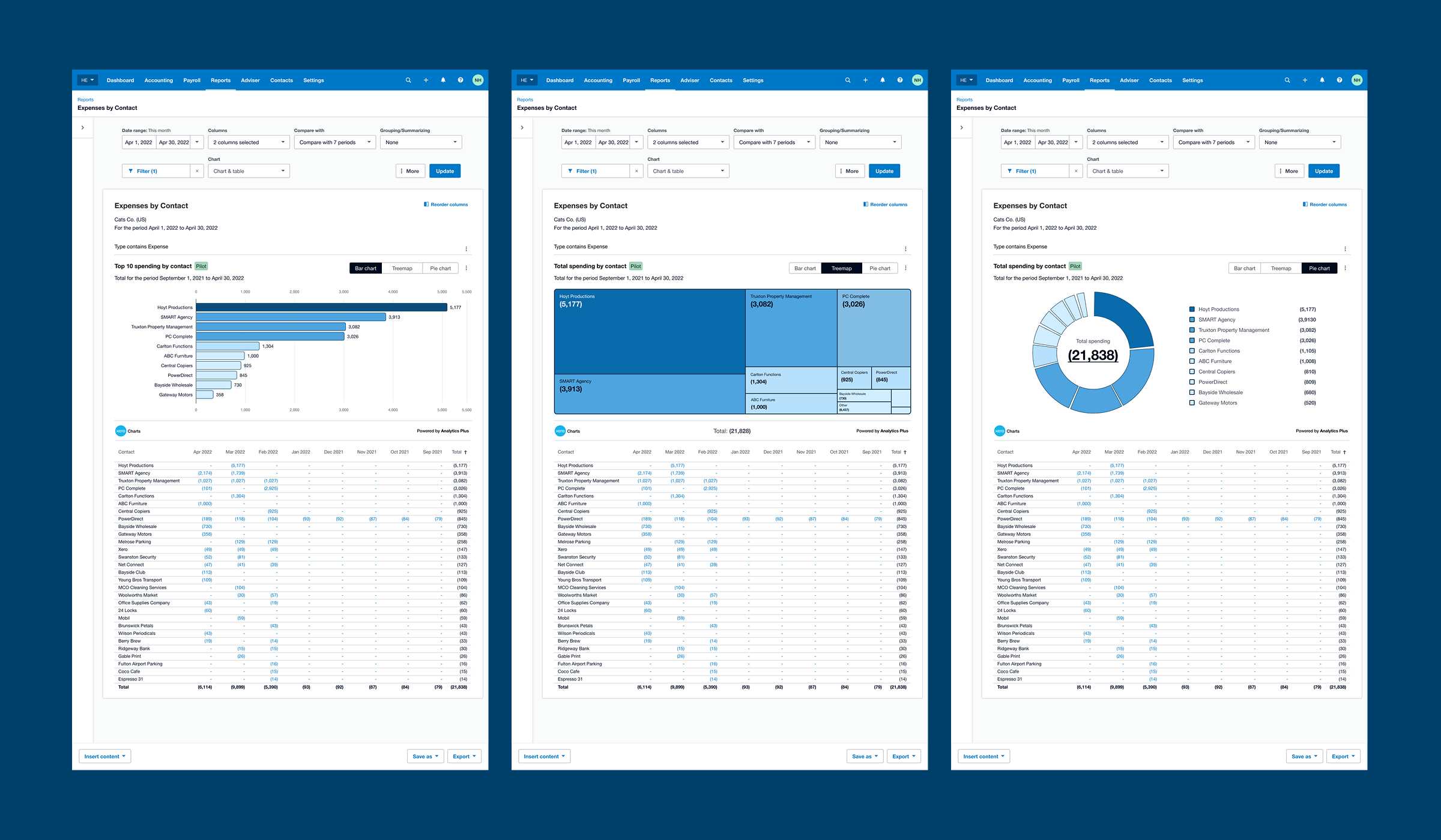 Three chart types were tested in the pilot to explore how different visual formats could support different reporting needs, from ranking top contributors to comparing totals and relative share.
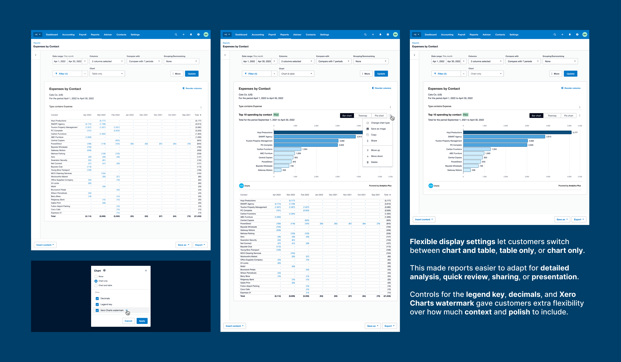 Display settings gave customers flexible control over how charts were shown, helping them tailor reports for analysis, sharing, and presentation.
I developed a scalable charting strategy for Xero Reporting, turning charts from a feature idea into a system-level capability that could improve financial understanding, strengthen connections across the product ecosystem, and create clearer pathways for future growth.
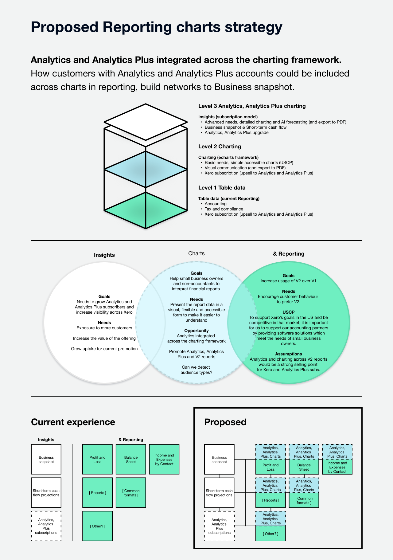 A proposed three-layer reporting strategy that keeps core table data intact, introduces accessible charting across key reports, and creates a clear pathway into higher-value Analytics and Analytics Plus experiences.